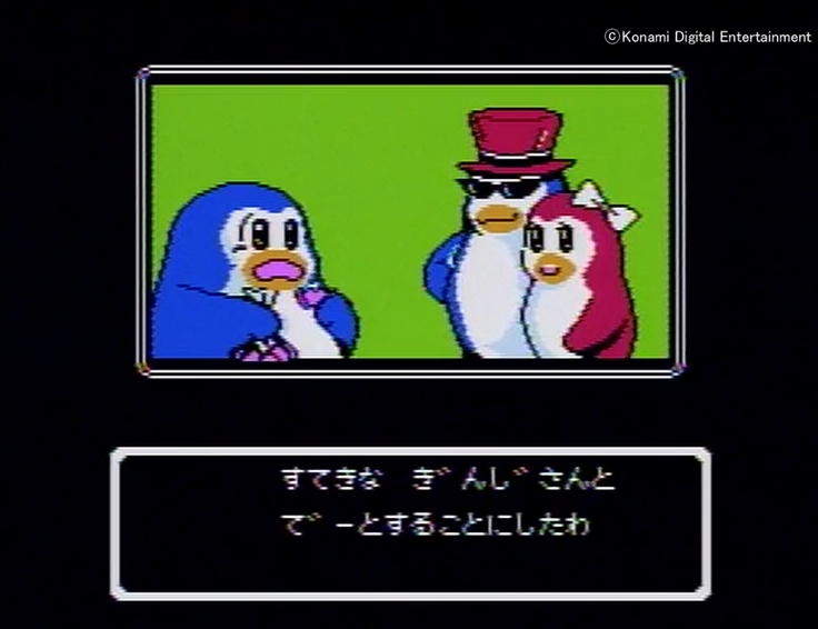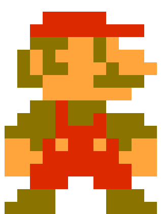
Now is the age of 3D. The dot-drawings that flourished in the past can hardly be seen anymore.
However, it is precisely at times like these that we look back to the past and trace the history of beautiful graphics created within the limitations of the 8-bit format.
Familiar! Super Mario Bros.
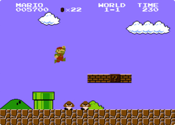
First, let's compare them with the most famous game in the world, Super Mario Bros.
The image is the Mario that everyone knows, Super Mario Bros. The patterns on the blocks, the glossy clay pipes, the glaring crib, etc. are all very well done within the strict limitations of the game.
The quality of this alone is high. ......
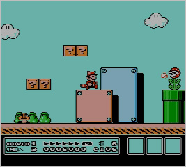
This one is from Super Mario Bros. At a glance, you can see that the graphics have evolved considerably.
If you don't know much about it, you can compare the two Mario games. 1 was too dotty at worst, but in 3, the lines are more rounded. The clay pipes have also changed dramatically.
Although external factors such as the increase in ROM capacity are also a major factor, this increase in graphics is still impressive even though the hardware has not changed.
Now, let's compare the results with another series.
The best FC graphics! Mega Man
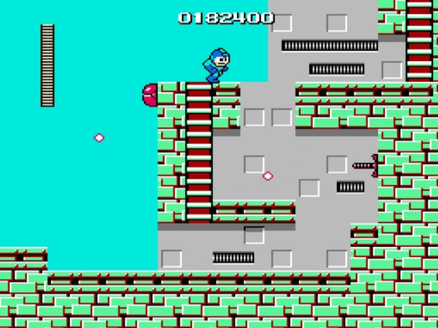
First, let's start with the first in the Mega Man series. In terms of graphics, it is only about the same level.
However, there were many games that were worse than this one, so the standard itself is quite high.
This is the evolution of the later games: ......
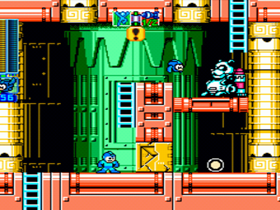
This one is probably easier to understand than Mario: it is a port of the PS version, but since it is basically a solid port, there are no changes in the graphics.
The expression of Mega Man and the enemy characters have not changed, and the improvement in background technology is blatant. The use of colors and the like is breathtaking. Compared to 1, which was flat, there seems to be more depth. It shows a considerable evolution.
It can be said that Mega Man 6 is the culmination of the development of the franchise's software.
Finally, let's compare national RPGs.
Graphics at ......? Dragon Quest.
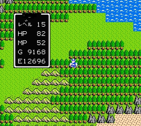
So let's start with Dragon Quest 1. It can be said that the graphics are charming, but on the other hand, they are flimsy and provide only the minimum amount of information.
At any rate, there is no difference between the top, bottom, left and right sides of the heroes. In some respects, this is unavoidable since the data capacity was so compressed that the characters used were cut down to the bare minimum. ......
And then to the legend: ......
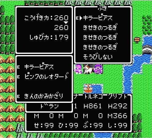
Dragon Quest 4.
...... Actually, the field screens haven't changed much.
The gameplay has evolved quite a bit, but DQ didn't evolve much in terms of graphics.
Still, though, each character graphic and the quality of the details have increased.
It wasn't until the SFC's 6 and 3 remakes that Dracula's graphics changed dramatically. It tells us that graphics are not everything in a game. One thing about ......, please forgive me.
summary
I hope you have learned that even among franchises, there are differences from one era to the next.
Dot pictures are not so common these days, but they still have a unique warmth to them.
While 3D and powerful 3D is not bad, it is better to be soothed by dots once in a while.
Well, that's all for now.