
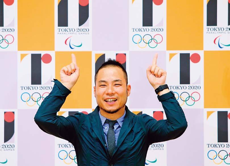
Here we summarize the work of Kenjiro Sano, a well-known art director, who designed the emblem for the 2020 Tokyo Olympics and Paralympics and then became the topic of controversy after the controversy over the selection process and the lack of originality of the entries, which led to the decision to stop using the emblem.
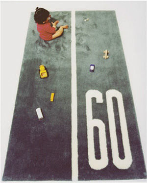
STREET RUG
Rug with speed limit printed

HOME MEMO BLOCK
A note block in the shape of a house
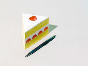
SHORTCAKE MEMO BLOCK
Note block of shortcake
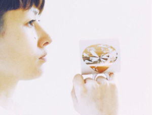
DIAMOND MUG
Diamond mug
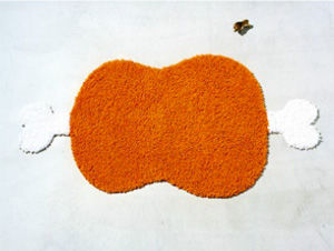
BIG BONE RUG
Primitive giant meat-shaped rug
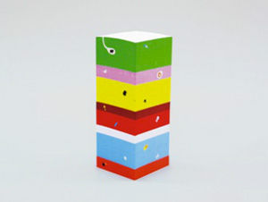
CHISO MEMO BLOCK
Note block of the formation
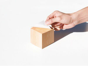
Hinoki Memo Cube With Fragrance
Japanese cypress print memo block
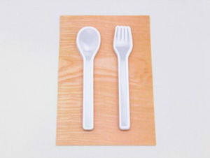
SPOON FORK FUSEN
Spoons and forks
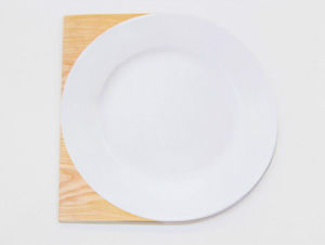
DISH NOTE
A dish-shaped notebook
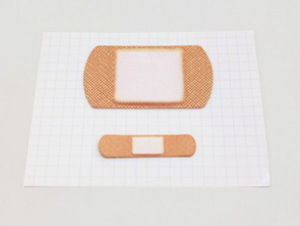
BANSOKO FUSEN
A sticky note in the form of a plaster
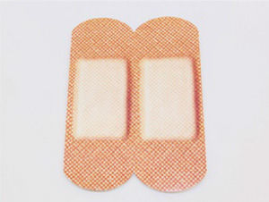
BANSOKO NOTE
Note in the form of a plaster
Promotion / Advertising / Poster

Source: 0001.seesaa.net

Source: nihongosubtitle.blogspot.com
Toyota: ReBORN Channel Series
Source: himawarioffice.blog11.fc2.com
au:LISMO!
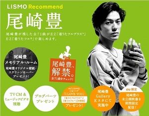
Source: ikazuchi02.exblog.jp
Au: Yutaka Ozaki, lifted
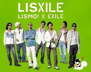
Au - LISXILE (Liszair)
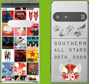
Source: blog.livedoor.jp
KDDI: Southern Mobile
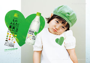
Source: www.suntory.co.jp
Suntory: GREEN DAKARA
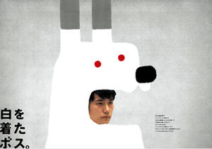
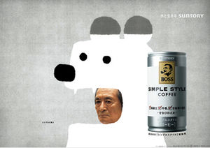
Suntory: Boss Simple Style
CM
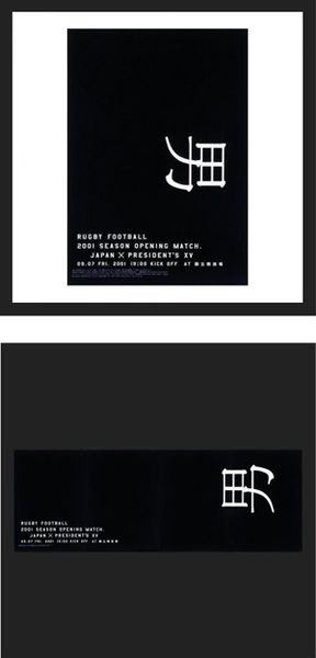
Japan Rugby Union: Men's Poster
"I thought it was amazing that kanji characters can express emotions and names on their own, unlike English characters. If that's the case, I thought that if you could show the momentum and hard-core spirit of rugby only with typography, the transmission would be faster and stronger. Just by rotating the character for man, I think I was able to create something that everyone could share and feel like rugby." (TOKYO TDC Kenjiro Sano comment)
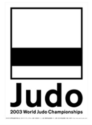
Japan Judo Federation: World Judo 2003
Logo featuring a black belt

Contents
- Kenjiro SANO (born 1972)
- [NEWS] On November 1st, 2013, we will publish a picture book on Dog Day!
- [Work] Oh! I've seen this! Representative work of Sano Kenjiro.
- Character Design / Logo
- Sano's CGC Chikayu gomibukuro
- Poster that can be attached to the bath: BATH ART
- nico products
- Promotion / Advertising / Poster
- Package design
- CD / DVD Jacket
- Product Design
- Books / letters (including self-written books / designs)
- Creators in Season: Amazing Awards