
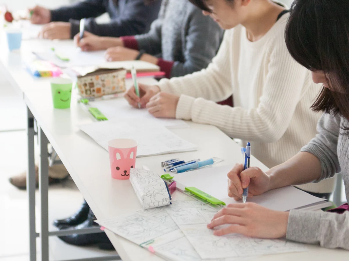
This article provides a summary of various tips for increasing sales of doujinshi. In a survey of people who have sold doujinshis, about half said that they had sold less than 30 copies. The article includes a number of ideas for tips for "doujinshi that sell," such as "making the background of the cover pink," "writing the title in a large, easy-to-understand font," and "drawing a cartoon on the cover. We hope you will find them useful.
How to write a title that stands out
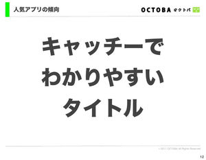
Large, easy-to-understand titles rather than design-related ones.
Source: kohada.2ch.net
Bold letters (Gothic rather than Mincho type)
Font color that is well balanced with the background color.
(pink, black on orange background (surrounded by white), white on light-dark background)
Place the title above the bottom 1/5th of the page.
Font should not be so elaborate that it looks like it is part of an illustration.
The title was easy to catch the eye.
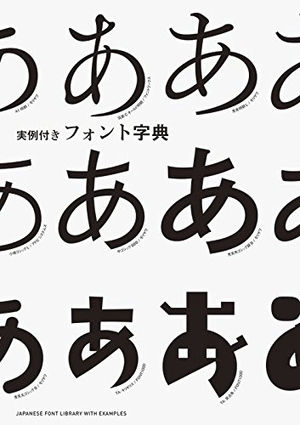
Source: www.amazon.co.jp
Compounds like hiragana + kanji are easy to catch the eye.
Source: kohada.2ch.net
People who can't read English titles at a junior high school level can't read them either.
Apparently, a compound title like hiragana + kanji is easier to catch the eye than hiragana alone or katakana alone.
In other words, it's like Ringo Shiina's music.
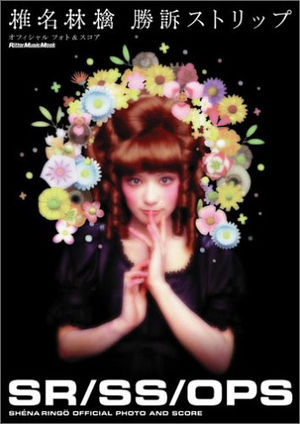
Source: shopping.ecnavi.jp
It's safe to say that only the title makes the content (gag, heartwarming, serious) easy to understand.
Source: kohada.2ch.net
Titles are important.
It's safe to say that the title is easy to understand the content (gag, heartwarming, serious).
It is especially easy to sell in bookstores.
(An extreme example would be "A book about XXX and XXXX" or something like that.
Long sentences in a foreign language that are difficult to understand, or that make your eyes glaze over.
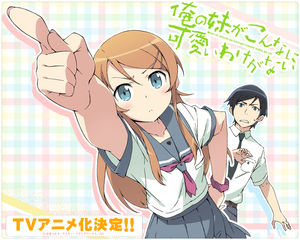
I made the title easy to understand, and sales went up remarkably!
Source: kohada.2ch.net
I had done "Their Everyday Life," "Their Everyday Life 2," "Their Everyday Life (Spring)," and the like, but this time, the content was the same as usual, but I tried to make it something that would immediately conjure up an image, like "Let's go on a picnic! The response was very positive!
Source: www.slideshare.net
Elements of a successful coterie magazine
One of the reasons they sell so well is because they are cheap.
Source: d.hatena.ne.jp
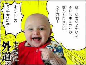
There is a circle called "Nekomaya. One of the reasons they sell so well is because they are inexpensive.
That's the consumer's point of view.
Source: ameblo.jp
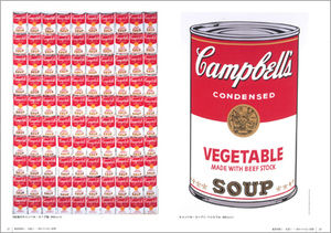
It is more important to print more and make it cheaper than to print less and make it more expensive, even if it means printing more than enough.
Source: d.hatena.ne.jp
The buyer does not care how many copies are printed. So even if you print fewer copies, you have to set a lower price or you won't sell as much. In my case, my goal is to distribute more copies than whether it costs money or not.
Source: ayanamirei.blog.so-net.ne.jp
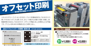
Offset from copy magazines
Source: d.hatena.ne.jp
For the same content, the offce will sell a whole lot better than the copy magazine, so let's go with the offce.
Source: www.kubonet.jp
Can you sell a badly drawn picture?

Contents
- Doujinshi" is a magazine that we want to get into the hands of many people anyway.
- table of contents
- Can doujinshi make money?
- Why we make dojinshi even at a loss?
- How to Draw a Doujinshi that Sells
- Cover of a doujinshi that sells
- Backgrounds of doujinshi that sell Pink is the strongest?
- Standout cover
- How to write a title that stands out
- Elements of a successful coterie magazine
- Can you sell a badly drawn picture?
- Even if you are not a good painter, you need to be able to sell your work.
- Space Devices
- Create an atmosphere of "pick-up
- Importance of POP
- Example of a "hook is too big" POP
- What kind of POP do you want?
- Advertising is also important
- SNS that can be used for promotional activities
- Blog appeal is a great publicity tool.
- incidentally
- Reference Site
- summary
- Related Summary